
When you open a website or an application, you first see various elements and sections on the interface. Their purpose is to be responsive towards the user.
A design theme is the overall appearance of an interface. It has various elements like the color scheme, layout, etc., that attract a user. It is designed in a way that draws a direct impact on your users' experience. One popularly growing design theme is the dark theme. It is now extensively being used in all popular applications and websites interfaces.
Let's have a look at what a dark mode design is and how it is used.
In this article
Part 1Dark Mode in Design – An Introduction
We know a person spends half of his day in front of different screens, be it a mobile phone, laptop or television screen, etc. The prolonged screen time and brightness greatly affect a person's eyesight. For the ease of users, interface designers introduced the dark theme color palette for websites and applications.
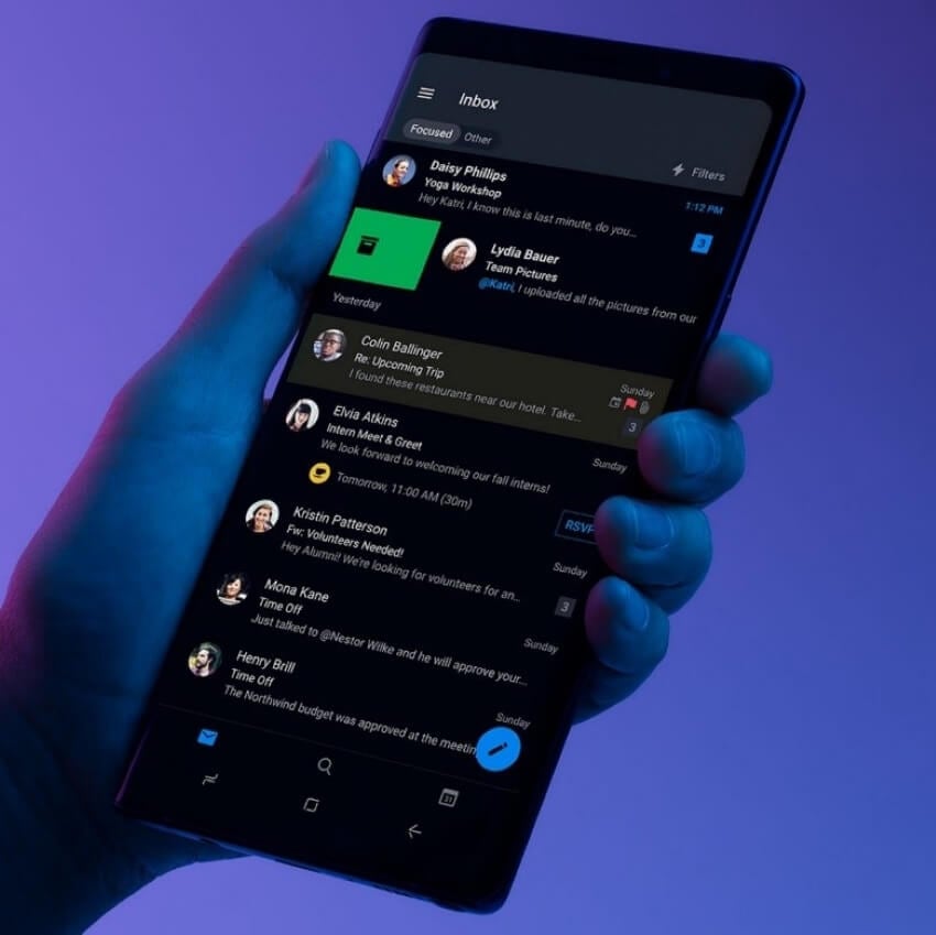
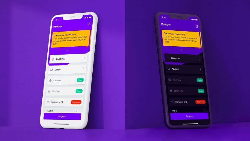
The dark mode is a dim-light user interface (UI) that uses a dark color, usually black or a shade of grey, as the primary background of the page. Nowadays, dark mode design has become a preference for screen users. It helps the users with eye strain and headaches. It is now a popular theme design, increasingly adopted in almost every site and application.
That dark mode was first used as dark background, as seen in The Matrix. This look was discontinued in the era of the 80s in support of black text on a white background. Later, dark mode ma its first comeback in Windows Phone is probably 2010. When it was found that dark mode saves battery life, the feature was added in Android OS and iOS in later years.
Part 2Merits and Demerits of Using Dark Mode Designs
Every design theme has its own merits and demerits. Suppose a theme design is user-friendly, but it also takes time to load its features. In the same way, some pros of the dark theme color palette are enlisted below:

- The dark theme gives an appealing or attractive look. They give web design a professional look. It shows that the brand or business has some class. Vibrant colors on a dark background are eye-catching for viewers.
- Bright color on dark shade helps in focus. It means darker backgrounds can easily draw users' attention to specific key elements of design. Important features of applications or websites interface look prominent in the dark-themed design. It proves a great help in advertising.
- Great merit is that it looks relaxing. Many users feel dark mode designdecreases eye strain and headaches, especially for people spending long periods on screen. Therefore, social media sites have launched their dark modes for users' ease.
- Most of the interfaces have a bright or, more commonly, white background. The dark theme can be a different way utilized for making a specific page stand out.
Along with its classy look, there are a few drawbacks of dark mode design as well. Let's have a look at them now.
- For some newcomers on-site, text can be harder to read. It is because we are habitual of black text on white background. So, the dark interface may become a cause of eye strain.
- Colors' behavior varies in display and print. Some saturated colors that work well on a black print design may look annoying in digitized form. Multiple design elements on a single interface look uninteresting.
- Colors convey different messages. Colors that suit on a white theme may not look good on a dark theme. For all the design elements, it requires careful consideration in choosing the color palette. Better to avoid too saturated colors.
- Light and bright backgrounds have been the norms in design. So they are easily accepted. But there is a chance that some users dislike a dark mode which may spoil their experience with web or application design.
Part 3Techniques of Using Dark Mode Efficiently in Dark Theme Website
Certain pointers should be kept in mind while going for a dark theme website or an application. For your convenience, we have listed them below:
Consider your Business/Brand
It is not compulsory to go for a dark theme for your brand or business. Therefore, the user interface UI designer must go through careful consideration. He must overview how and what darker shades should be adopted that enhance the product or page. Use color contrast that shows the product's responsiveness.

Not Absolute Dark
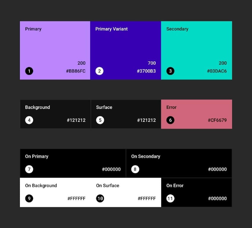
Dark theme color design doesn't mean a pure black background is mandatory. The dark theme can range from shades of black to tones of grey. For some websites or applications, dark grey can accomplish the same look and feel as pure black. For the user's better focus, it is suggested to soften the contrast between text and background.
Decent Color Contrast of Text and Background
With dark theme background, always go for less saturated colors of text. The saturation of a color refers to its intensity. The high saturation of both text and background looks too vibrant for the end-user. Ensure that content is easy to read in dark mode. Better use color contrast tools.
Avoid Theme Inversion
To apply a dark theme mode to your website or application interface, do not just invert the lighter theme. This gives weird color contrast and is disturbing for the viewer. Therefore, a UI designer must carefully design a dark theme website design.

Test and Trials
Before finally launching the site or application, carry out some tests. It is better to go for trails using different color contrasts tests between background and foreground. Experiment with different styles and design elements. See how the interface looks. Receive feedback and then adjust the design accordingly.

Final Words:The article has given a detailed preview of the trending dark theme interface design. It also possesses some basic tips and tricks for the UI designer. The pointers will be helpful for a designer who is thinking of revamping his website page or application. Moreover, we hope that this article proved to be quite simple in understanding dark mode design.