In 2021, starting a YouTube channel has become one of the most promising careers for individuals across the globe. It's the perfect place where you can showcase your talent, acquire an incredible following, and make thousands of dollars. One of the biggest advantages of starting a YouTube channel is that it'll allow you to turn your passion into your profession and step away from the rat race that everyone else is following.
However, all these goals are only achievable when your videos attract an audience. If you don't get enough views, you won't be able to make any money from YouTube whatsoever. While your content will be the most crucial element to engage the audience, there are several other factors that could help you grab the viewer's attention. One such factor is YouTube channel art. If you want to engage first-time viewers, you must design a visually appealing YouTube channel art to do the job.
In this guide, we'll take a look at some of the best practices to make YouTube channel art and how you can increase your subscriber count with the channel art. We'll also take a look at how you can design stunning YouTube banner images using PixStudio - an online designing tool for professional designers.
In this article
Part 1 Understanding YouTube Channel Art
If you are new to the YouTube realm, here's what you need to know about the 'channel art'. The channel art, also known as the YouTube banner, is the image that you see at the top of the YouTube channel. The primary objective of the YouTube channel art is to describe what your channel is all about. For instance, Sam Kolder has used a collage on his YouTube channel as the banner image.

This image clearly describes that Sam is a videographer/photographer who loves going on different adventures. This is one of the major reasons why he has millions of followers on his channel. If you want to replicate the same results, you'll have to design a banner image/channel art that showcases what viewers can expect from your channel.
Of course, you won't design the best channel art in the first go. In many situations, YouTubers try 5-6 channel arts before finalizing the most suitable one. But, by following the right guidelines and designing practices, you can speed up the entire process and edit these 5-6 templates more quickly.
Part 2 Basic Guidelines for a Proper Youtube Channel Art
Fortunately, YouTube has released a few official guidelines for background YouTube banner size. Follow these guidelines and you'll be able to keep your channel's banner image optimal on all devices. These guidelines include:
- The ideal channel art size is 2560x1440 pixels. However, these dimensions are optimal for TV screens only. YouTube will automatically delete a few elements of the design while displaying the banner across other devices
- The minimum file dimension recommended by YouTube is 2048 x 1152. If your banner image is smaller than the recommended size, it won't look good on large TV screens.
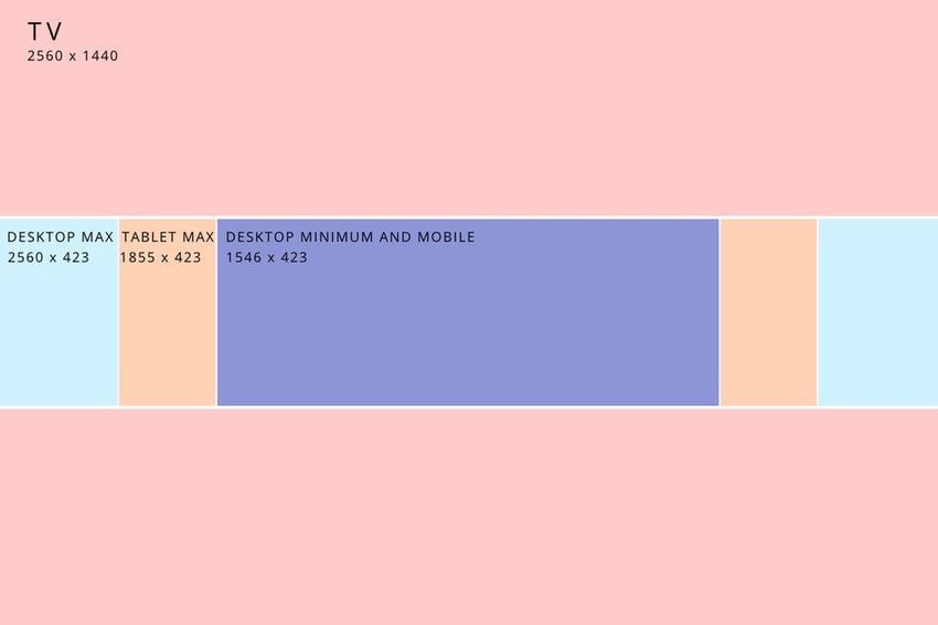
- If you are adding any text or logos to the banner image, it must be included within the 1546 x 423 pixels dimensions. This is the area that's visible on almost every screen and will help you grab the viewer's attention
Part 3 Best Practices to Follow for YouTube Channel Art
So, now that you're familiar with the official guidelines for YouTube channel art, let's take a look at some of the best designing practices that'll help you create visually appealing banner images for your channel. It doesn't matter if you run a travel vlogging channel or publish normal vlogs, these tips will help you design highly appealing YouTube channel art and engage your viewers more effectively.
1. Don't Complicate It
One of the most effective ways to make cute YouTube channel art is to keep the design as simple as possible. You would not want to add too many elements to the banner image. Why? Because it might distract users and shift their focus from the actual logo, message, or brand USPs. Prioritize elements that convey your brand values and make sure they are at the center of the banner. This will allow you to grab the viewer's attention and turn visitors into long-term subscribers.
2. Focus On Size
As we mentioned earlier, the banner's size will play an integral role in designing a successful banner. Here's a quick breakdown of the banner's layout on different screens.

As you can see that only the area within the 1546 x 423 pixels dimensions is visible across all devices. So, your brand logos and important elements must be placed within this area only. These elements will be visible all the time, irrespective of the device's screen size.
3. Your Brand's USPs
At this point, you already know that the primary objective of a YouTube banner art is to define what your channel is all about. For instance, if you want to become a travel vlogger, your channel art cannot include pictures from your office. Instead, you would want to add your vacation images and customize them to draw the viewer's attention. The general thumb rule says that your channel art should revolve around your niche, but must be different from your competitors so that you can gain a competitive edge in the market.
4. Use Text to Deliver Your Message
Some YouTubers also add dedicated text boxes to convey their message via the channel art. If that's the case, however, you must remember that the text should look natural with the overall color scheme of the banner itself. You should also choose the right font style and font size to ensure that it is visible to the users across all devices.
Part 4 Using PixStudio to Develop the Best YouTube Channel Art
So, how can you make YouTube channel art that engages the viewers? Apart from a ground-breaking idea, you'll also need a professional editing tool to design the banner. While there are different options to choose from, we recommend using Wondershare PixStudio. It's an online designing tool that you can use as a professional YouTube art maker. It has hundreds of built-in templates that you can integrate into your design with a single click. These templates are designed for different business niches, which means you won't have to start the designing process from scratch.
All the templates available in PixStudio are easier to customize. You can add/remove elements, change color schemes, or even add text blocks to design personalized YouTube channel art. Wondershare PixStudio houses a fully functional editing panel as well. This means after you've chosen the right template, you'll be able to change its preferences to build a custom YouTube banner image.
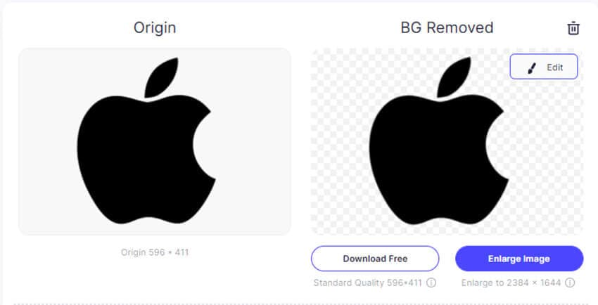
One of the major advantages of using PixStudio is its built-in background remover. So, if you are adding a logo, you'll be able to make it transparent so that it doesn't affect the overall color scheme of the template.
Here are some of the exclusive features of Wondershare PixCut that make it the best YouTube art maker.
- A plethora of professional YouTube banner templates
- Fully functional editing panel with easy drag-&-drop features
- Built-in media library that includes several vector graphics
- Easy-to-use Interface
So, here's the step-by-step process to make channel art for your YouTube channel using Wondershare PixStudio.
Step 1:
Go to https://ps.wondershare.com/ and click "Start Design Now".

Step 2:
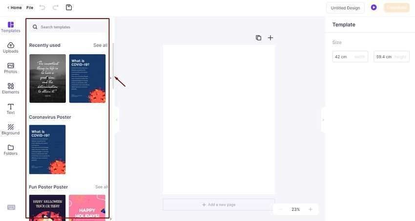
You'll be prompted to PixStudio's editing panel. Here click the "Template" tab in the left menu bar. Then, use the search bar to find a specific template or explore different categories to find a suitable template for your design.

Step 3:
After you've picked the right template, click on it to bring it to the main editing interface. You can now switch between different tabs (elements, image, background) in the left menu bar to control different elements of the template. You can also click the "Text" icon to add text to the design.
Step 4:
Once you're happy with the design, simply click the "Download" button at the top-right corner. You'll be asked to choose the correct output format. Use the dropdown menu to specify the output format and then click "Download" to save the banner on your system.

So, that’s how you can use Wondershare PixSudio as your official YouTube banner image-maker and design visually appealing channel art for your YouTube channels.
Conclusion:YouTube channel art is one of the most crucial elements that’ll help you acquire new subscribers more conveniently. As soon as a viewer will open your channel, the banner image will be the first element in his sight. So, to increase your odds to get new subscribers, it would be important to follow the above-mentioned tips to unleash your creativity and design highly enticing and cute YouTube channel art for your channel.
