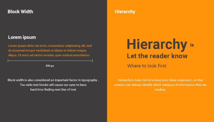
We have seen that in any organization or system, several members are arranged in a specific order responsible for producing an outcome. A product is produced when passed on from one end of the team to the other, each performing their designated functions. That's the thing about hierarchy. It is required for effective results and positive outcomes in any work.
Likewise, a design is not a design if it does not have its visual hierarchy. Now you must be wondering what sort of hierarchy is required in UX design. For this, read the article below to resolve your queries about visual hierarchy.
Part 1 How Do you Define Visual Hierarchy?
Visual Hierarchy is defined as a specific order in which different design elements are placed to create a visually attractive design.
In the visual hierarchy design, elements are organized in order of their significance. Design elements include contrast, balance, scale, brightness, etc. if they are used rightfully. It is a principle of using design elements to make a design that is exquisite and attractive to the viewer's eyes.
A designer must carefully design a hierarchy of elements so that user interface design is free of disturbance and friction and easy to see and work for viewers.

Part 2 Major Principles of Visual Hierarchy for Designers
Hierarchy principle of design have major key points that tell where to focus and how much to focus on a certain point. Visual hierarchy web design tells where to navigate the viewer's eye, showing them the most important information first and seconds later. Major principles to be considered in this procedure are given below:
Size
Size matters the most. It is a great strategy for emphasizing something. We have heard the phrase, "the bigger, the better." Well, in the case of text display, it also works. Important data should be displayed in greater size to catch attention first. The size principle goes for graphic or visual data as well as text. It tells the viewers the significance of data.

Color and Contrast
No visual design is complete without colors. Just like size, there is a principle of attraction for colors too. Brighter colors attract rather than dull hues. Colors are significant in hierarchy graphic design; therefore, color scheme of the interface is chosen meticulously. The sharp contrast between colors is more vibrant and grabs attention. Colors and contrast, tint, temperature, and saturation must be selected to show harmony.

Typography
Typographical hierarchy is also a principle of visual hierarchy. The font type, style, size, layout, and accurate spacing are included in them. Typeface selection is also crucial. It affects the order in the visual hierarchy. Considering the typeface, go for typography designs. Different designs of text draw attention and can help distinguish the message it is conveying.

Navigation
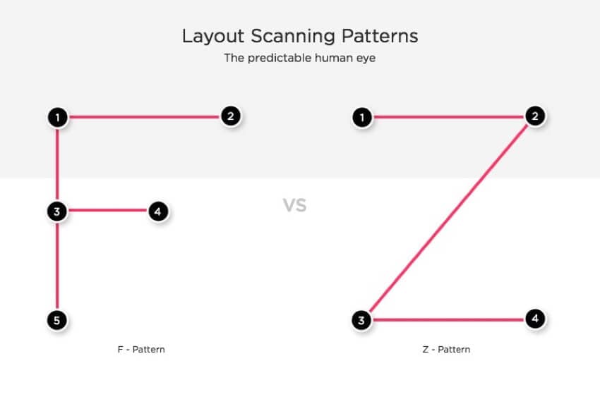
The user interface is given a page layout that navigates how a viewer will see it. This principle is about directing the reader's eyes from one corner to another. What data should be observed first and what data should be observed later is designed under this principle.
Two such examples include F-Format and Z-format design. F-Format design has important points placed on the left side of the page. Z-format, on the other hand, has important notes or design features along the Z path of the page.

Balance and Space
This hierarchy principle of design is about creating your mainstream and creating viewers' interest. There should not be some extra or negative space on the display page. Design elements should be placed in an aligned manner. A balance must be observed between each design element. No feature should be dominating over another.

Structure
Page layout or user interface should have a definite composition. A grid of horizontal and vertical lines should be used. An invisible grid must be followed for placing the elements, imagery, or text in their right positions. One most suggested principle here is the Rule of Thirds and the Golden Ratio. It is advised to apply them for highlighting and lowlighting different aspects.

Part 3 How to Design an Appropriate Visual Hierarchy? - A Constructive Explanation
A designer has to carefully consider all the principles knowing how the visual hierarchy works. To get a unique and aesthetic design, the following key points must be kept in mind:
Understand the Product
Firstly, the designer must understand and know about the product. He should be well aware of what sort of design the client is demanding. He must know the product format or means of advertisement. For instance, is it a flyer, web page, packaging design, letter, logo, etc.? Knowing that should help him go for designing using visual hierarchy examples.

Choose the Patterns
There have been traditional patterns for design. Reading pattern goes top to bottom, art or drawing is adapted in landscape or portrait pattern. Seeing the product and its demand market, a pattern for design must be followed.
For example, An F-pattern is suggested on the back of a dairy product packaging.

Suitable Shape and Shades of Elements
Either digital or manual layout or display, the shape and sizes and color, and hues of design matter. Not least important information or design element should be vibrant in colors and big in size. It will catch unwanted attention, and the viewer will be lost connectivity with actual information.
For example, the TIMES magazine cover page shows how the shapes and sizes function. It shows the functions of text in different settings.

Follow the Right Composition
The visual design must be distributed and aligned nicely. Any portion should not look extra vacant. The Rule of thirds or golden ratio is very effective in grabbing the viewer's attention.
For example, a pamphlet or a website of a famous fast-food company follows the right composition.

The Bottom Line:Hopefully, this article has done its job in clarifying the concept of visual hierarchy. Moreover, it also covers major principles of visual hierarchy and what techniques should be opted for getting the best possible outcomes of an emphasized design.
