Ever see a logo consisting of a few letters, and you are instantly clicked with the company's name? Well. That's how the monogram logo design works. A logo is an identity of a company or a business. They function as a symbol to represent a brand.
All the popular, as well as minor businesses, use a symbol to represent their work. These symbols are of different styles and designs. They may range from bold and dark colors to a minimal drawing made up of soft colors. It shows the individualism of a company or brand.
Here we will study one such type of logo design, the monogram logo along with its appropriate monogram logo examples to understand it to the fullest.
In this article
Part 1 What Should you Know About a Monogram Logo?
A monogram logo design or symbol is representative of a company or a business. It usually consists of one, two, or a maximum of three letters or symbols. Although monogram is a compound word that constitutes "mono," which although means one; monogram logos can have at most three symbols or letters.
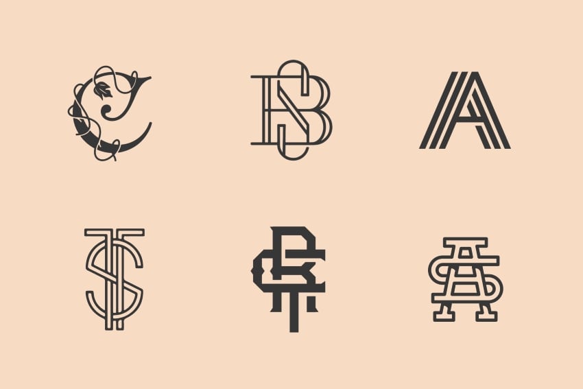
In practice, it is seen that brand monogram design consists of initials of the company or brand's name. Therefore, it is also known as a letter-mark. They are an amalgam of typography and object design. Most of the famous brands use monogram logo design. A monogram is created to tell the name of the company as well as the vision behind it.
It is better to have a look at an example before proceeding further.
We have often seen the monogram logo "HP." The letters HP are found to be craved on the laptop's back. "HP" is an abbreviation of the company's name, Hewlett Packard. The letter HP depicts us that it is a logo design of a tech company. There's a chance that many of us are unfamiliar with its full form. But the created monogram works as identification of the company.
Part 2 Reasons to Choose Monogram Logo for your Business
Monogram is one of the oldest forms of identity. In ancient times, monograms were used in stamps, coins as well as on letter invites. Now, they are used as logo designs that ranges from clothing brands to hi-tech companies. They have a class and make the company stand out.
So why should your start-up have a monogram logo? Here, we have listed some reasons that you can skim through.
Monogram is Minimal
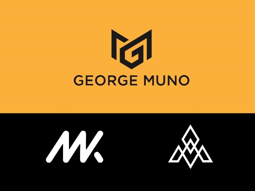
A monogram is a simple and elegant symbol for branding. It is a minimal representation of the company. Since millennials and Gen Z are both obsessed with minimalism, it will catch several attractions.
Globally Recommended
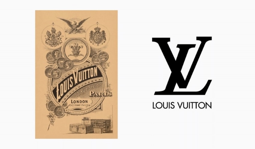
If your business is there to work internationally, a monogram is the best choice. It will eliminate the need to speak the exotic name of the company. It is easy to identify and remember. For example, LV is a high-end fashion company. Not all of us can accurately pronounce its French name ‘Louis Vuitton.' But we do recognize it as LV. Similarly, once your business gets flourished, the brand monogram is there to stay.
Covers the Name or Identity
Turn to an appropriate monogram if your business or company name is either too long or difficult to learn. The monogram enables typography and art to work together and create a unique symbolic logo for the brand.
Simply Catchy
If the logo maker uses different colors for the start-up, a monogram should be preferred rather than an abstract design. Too complex and intricate logo design does not look attractive at all.
Professional and Classy
Especially for companies or business, monogram looks professional and appealing. A monogram shapes into any tone and taste when used with the right font. For example, the m monogram logo of a big food-chain company such as McDonald's looks jolly and light.
Part 3 Design Tips you Should Follow While Making a Monogram Logo
Creating a company or brand's logo is like choosing and designing how to leave the first impression. It affects customer's attitudes and the public's viewpoint. For making a monogram, a monogram logo maker carefully considers all the aspects that will take the company to heights because of the designed emblem.
Here are some of the tips that the logo designer must keep in mind while he is about to create monogram logo.
About the Brand or Business
The first and foremost step for a designer is to know the brand or business. He should make a monogram that conveys the message of the brand or business. A person who sees understands it well, whether if it's a brand of footwear or a business of décor. A monogram should convey the concept.

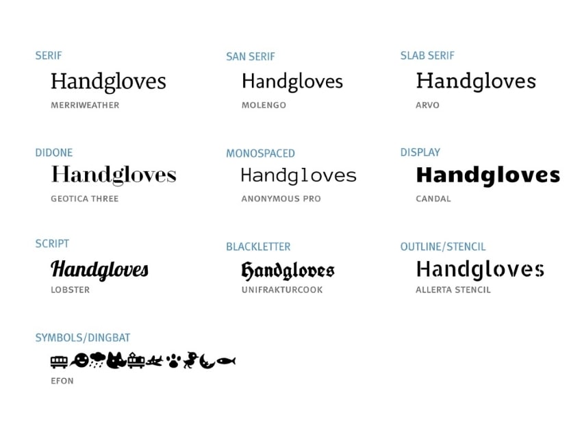
Selection of Typeface
Meticulously opt for the typeface of monogram logo design. Shape, font, background, and color scheme should be chosen quite wisely. Monograms must have a distinct signature style.
Balanced Design
Monograms must have an equilibrium. No element should be too obvious or dominating. The logo designer must look after the symmetry in a monogram design.
Layout for Text
Along with text, shape and style are also significant. The logo's shape can be both traditional as well as contemporary. The text font can have different layouts. Some common layout examples are handwritten, mirrored, interconnected, etc.
Color Scheme
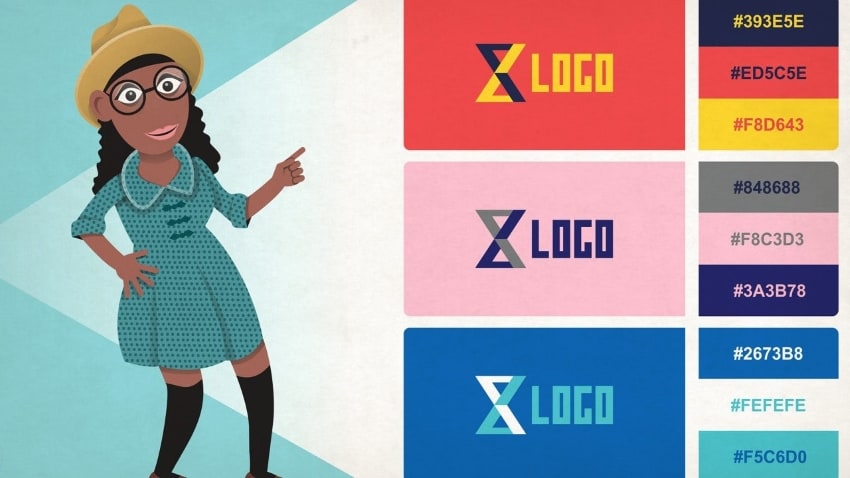
One important aspect of any design is selecting a color scheme. Go for the colors that highlight the emotions, which are suitable with a company or business. A suitable contrast between different colors looks good. Monochromes are never out of style.
Closing Words:
Monogram logo designs are conventional, appealing as well as aesthetic icons of a company or brand. It works like icing on the cake for a business. Therefore it must be attractive. This article has told why we should use a monogram for a business and how to design it perfectly with a monogram logo maker.
So, budding founders and logo designers, all it needs is just a little imagination and creativity to come up with the exquisite monogram of your company.
