
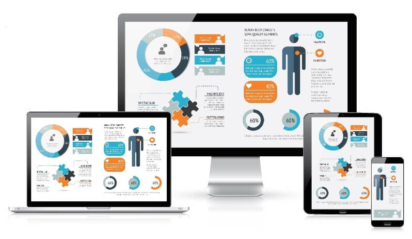
You may have heard the quote, "The customer is always right." This states that fulfilling the requirements of clients and customers has to be one's top-notch priority. Resultantly, creating mobile optimized websites needs the effort to browse and navigate through their phones effectively.
The brands often go through with the mobile friendly tester. It is a tool that lets the websites enter the URL, and Google measures how mobile-friendly it is. One has to ensure that the user can effortlessly access, navigate, browse, and scroll the web page on a mobile phone. To do so, follow and explore the article with us profoundly.
Part 1 Things You Should Know About a Mobile-Friendly Website Design
There is much depth to the terms when one studies them in detail, right? There are multiple ranges of things that the user does not know about a mobile friendly website design. But no need to worry, as we are here at your disposal. This section brings all the needed information that the readers have been looking for since forever.
- A mobile friendly website means that the webpage is designed and tailored to be used based on handheld devices. For instance, tablets, and smartphones.
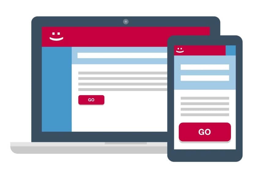
- The mobile friendly website design ensures that the website is mobile and responsive at the same time.
- The mobile friendly website aids the user in easy navigation, effortless touch, facile movement from one option to another, and responds in time.
- Moreover, the user can read text easily and looks presentable to a wide range of clients.
- The perfect friendly website design has to be protected and secure. People often prefer to tap on the webpage with a green lock instead of one that says, "Not Secure."
- As smartphones are dominating over systems, shopping habits have also evolved tremendously. This boosts the importance of Google mobile friendlywebsite design excessively.
- Most entrepreneurs ignore the need for a mobile friendly webpage, but the truth is different. If you want your business to bloom indefinitely, having a mobile optimizedwebsite is your way to it.
Part 2 Tips for Making Your Website Mobile Friendly
As mentioned above, a mobile friendly website design helps the user have a great experience when using it from a mobile device and not from the system. The elements, panels, and structure of the webpage remain intact and presentable. Graphic designers and computer scientists require workable tips to design a mobile friendly website design for smartphones.
Luckily, the section offers some amazing tips to do the trick. Let us start this!
Functionality and Workability
The websites become mobile friendly when multiple functions offer ease to the user. This includes swiping up, touching, dragging, holding, and pinching. The designer should study these gestures and swiping functionalities to offer mobile optimized websites for the clientele.

Effortless Navigation and Intuitive Interface
The effortless navigation in mobile friendliness websites lets the end-user access the parts of the website without going through all of them. At the moment, the web pages incorporate a big icon layout that helps you what to do next, hence offering an intuitive interface.
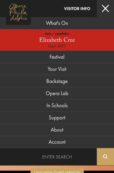
Simplified Menus and Typography
Where desktop websites have space to offer many menus on the interface, the mobile friendly website design lacks that. Henceforth, keep the layout minimal and simple that covers major options. Ensure that a "Search" feature is offered that permits the customer to look for the menu they need.
The same goes for typography. It is mandatory to stick to the standard and classic fonts and use a font size of at least 14px. Make sure that you run a Google mobile friendly tester. This guarantees that the font is readable and legible to the viewers.
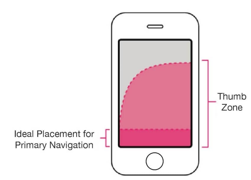
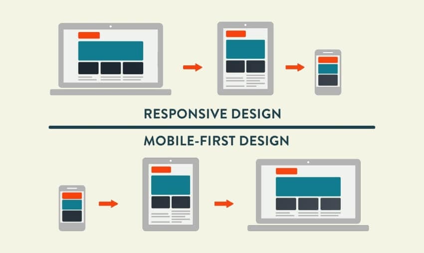
Mobile-First Approach
The Google mobile friendly tester tends to make the website owners invest in a mobile-first approach. The designers now consider the mobile layout as the main version and base their decision on that. Moreover, it is easy to expand the simpler layout (mobile version) to turn into a complex one (desktop version) and vice versa.
Responsive and Fast Speed
Regardless of one's internet speed, the responsiveness status of a webpage pretty much controls its SEO ranking. The designer needs to ensure fast speeds are ensured; otherwise, the user would not wait much longer to load it. A responsive design enhances the certainty that no information is limited for mobile users compared to desktop websites.
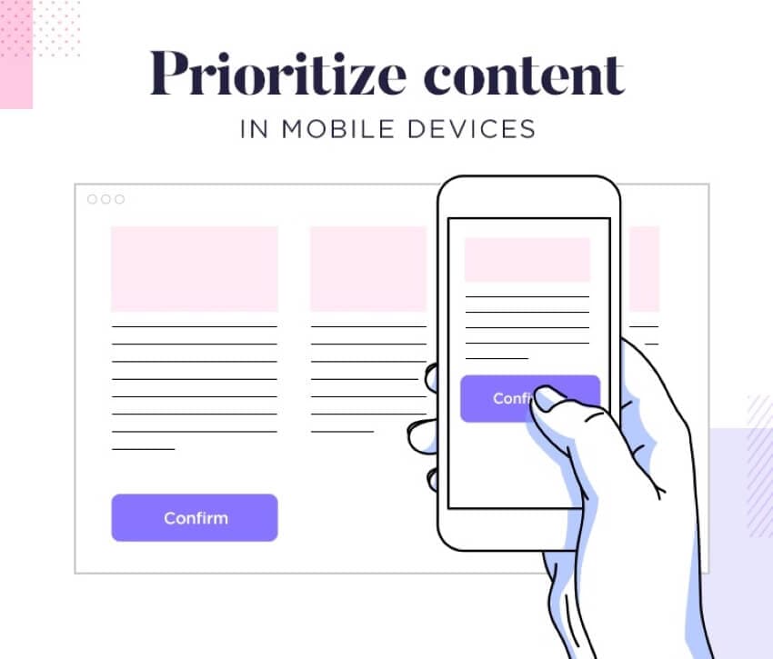
Primary and Secondary Content
A good designer knows the difference between primary and secondary information. This means that he knows what is important to be shown on the interface. Therefore, make sure that the website permits collapsing of secondary content to create more room for the main and in-depth information.
Part 3 PixCut- A Mobile-Friendly Al-Background Remover Tool
The mobile friendly websites have become a thing now, and there is no denying the fact that mobile optimized webpages are the future of this generation. One of the uprising tools that solve the problem of the unique nature allows me to present to you a Google mobile friendly website-PixCut.
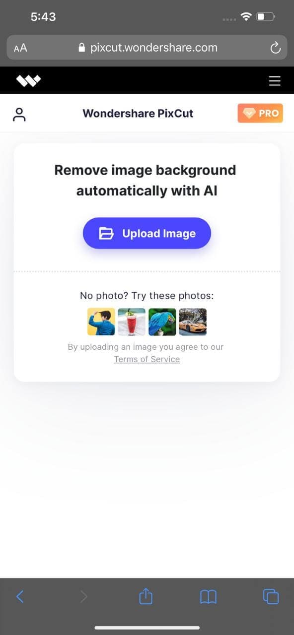
With a responsive design, effortless navigation, easy workability, and blocked pops up, PixCut has changed the way we see the world. The user is free to access this from the smartphone and change background, add text, elements, and whatnot. This mobile optimized website shall not disappoint you as it brings a smooth and intuitive interface while making the experience flawless and ideal.
Final Words:The Google mobile friendly tester presents a facile opportunity for all the brands and companies to test the mobile friendliness of their web pages. The article under review gave the readers the basics of mobile friendly websites and some tips to make the system better and accessible through the mere usage of thumb. Wondershare PixCut was also introduced as a mobile friendly web application.