Which color is the best color for logo design? We all know about color psychology, which revolves around the right selection of colors. It has a great impact on our behaviors and emotions. However, if you don't know about logo color schemes, you might face trouble becoming a professional logo designer.
How come colors are so important for logo designing? Colors define the mood, and so does it help showcase a brand properly. A lot of attention and keenness is required to create a fascinating logo. In this article, we will help you to find out the best color for your logo design.
Part 1What are the Different Meanings Behind Brand Logo Colors?
The choices of colors in your logo build a visual connection to your organization's personality and values. It can visually communicate the company's sentiments to its customers. Simple logo color can help customers understand the objective of a company. There is a range of colors that can be and are used in logo design.
Red Logos
If you ever consider making a brand with a young, passionate, and aggressive ideology, put up red logos to make your idea more vocal and attractive.

Yellow Logos
The color of comfort, happiness, and relaxation can be your choice if you wish to design a comforting system for your customers. A yellow logo would outshine your brand.

Blue Logos
Blue logos promote serenity and calmness through their exceptional outlook. This brand color is majorly common among medical and healthcare brands, as it depicts an inspirational concept amongst its audience.

White Logos
Although it acts as a secondary color, white is a color of sophistication. If you use white across your black logos, it makes it exclusive and clean for the audience.

Purple Logos
If you ever consider designing a royal logo for your brand, you should add purple to it. Not only does it display exquisiteness, but navy logos and purple logos are also found across major cosmetic brands.
Pink Logos
The pink logo directly targets the feminine approach of a company. Although it targets a specific gender, this color is also utilized to display youth and beauty as a primary factor of the brand.
There are loads of colors we can look into; however, it would be an exhaustive list that people might have to go through before finalizing the logo color.
Part 2How to Use PixStudio for Designing a Logo?
Wondershare PixStudio has made it exceptionally easy for graphic designers to illustrate their ideas onto the platform without going through hefty edits and detailed figuration. This provocative tool is the ultimate solution one can expect while looking for time-saving techniques.
PixStudio has made it possible for users to design logos, posters, thumbnails, and many more designs in n time. It helps users unlock their creativity with impressive tools and assets. As it gives its users the authority to change the backgrounds of their designs, utilize different elements across your ideas, and make enticing edits all over your plan, it makes it more tempting than ever.
If you ever come across counting the number of benefits PixStudio offers to its users, you'd get exhausted while listing them on a piece of paper. To know more about designing a logo appropriately, you should follow the steps explained below.
Step 1: Be a Part of PixStudio
Before you go anywhere, you should sign yourselves up on PixStudio. After joining the family for free, tap on "Start Design" to move onto the next page.

Step 2: Start Your Logo Designing
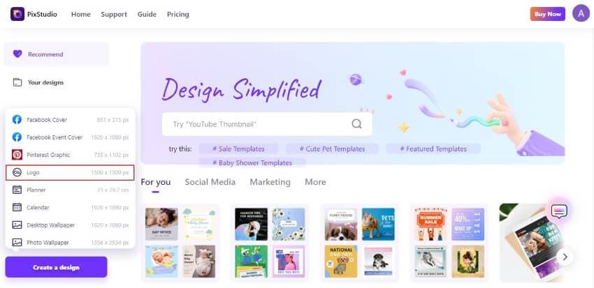
Following this, tap on the "Create a Design" option on the bottom-left of the page. From the pop-up menu, select 'Logo' to proceed onto the editor.
Step 3: Find Your Template
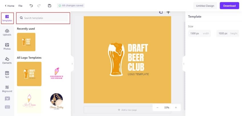
PixStudio offers a list of logo templates on the left-hand panel of the screen. You can either select from the available list or even search across the "Search Templates" bar to find a niche-specific or industry-specific logo template.
Step 4: Edit Your Logo Template
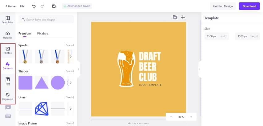
Once you have selected a template, you can add different elements, text, change the logo color of your logo, and even make necessary background edits to make it look more attractive. You can access all of these options across the toolbar on the left.
Step 5: Download Your Creative Design
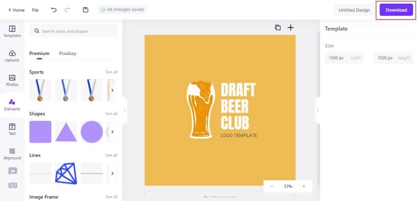
Now you can easily download the logo design across your device by tapping on the "Download" button. Either save your file in JPG, PNG, or PDF format at your convenience.
Part 3What are the Things You Should Avoid While Selecting a Logo Color?
Failed to make an exceptional logo that could attract people to your brand or product? You should definitely get yourself introduced to the blunders that designers make while figuring out the best logo color for your design.
Do you really think an orange logo would fit your brand description? Look over the following things that you should avoid while selecting a logo color.
Being Unsure About How You'll Use the Color
The color concepts behind businesses are usually based on the product or service they intend to sell. A brand is identical to a personality, and its in-depth analysis is extremely important before coming to any conclusion.
Many designers fail to understand the necessity of making sure that colors should translate well to the application offered by the consumer. They should carry out detailed studies on the brand's mission, vision, and customer interaction, which would then influence conceptualizing a logo.
Failing to Understand the Right Inspiration for your Brand
In this digital world, people look for different inspirational ideas while developing their brands. Although this technique is extremely effective for users for helping them refine their thoughts about the design, it should be carried within a certain environment.
This environment requires relevancy, relevancy in the type of business selected during the search, and the target audience. For instance, if you use the logo design idea of MailChimp as a financial planning consultancy, its yellow and humorous monkey logo would not fit with the objectives of your business idea.

Purity in Logo Color
A green shade across your pink logo would seem so odd to people if not properly used. Colors across the logo do not fit under conditions if their saturations and values do not match. It is extremely preferred to select logo colors that have similar values and saturations. This helps keep the design easy and attractive for the viewers.

Final Words:
Colors have a very important role throughout the life of an individual. Whenever a company designs a logo, they work across the color scheme of their logo design to determine how they would target the market. Various aspects should be observed while setting up a logo color. If you follow all the tips and techniques stated above, you will find it convenient to enhance your logo design.
