The banner image is one of the most crucial elements of running a business page on Facebook. It's the first thing that people will notice after landing on your Facebook page and will have a huge impact on whether they click the "Follow" button or not. Not to mention, using a creative Facebook cover will also help you convey your business objectives to your potential customers and increase your fan following as well. Another potential advantage of the Facebook banner is that it'll give your brand a competitive edge in the market.
However, all these goals are only attainable when the banner you're using on Facebook has an appealing design that could engage the audience. If you have recently created your Facebook page or the number of followers has suddenly plummeted on your Facebook page, this guide will help. In this article, we have put together a complete list of tips that'll help you make perfect banners for your business page on Facebook.
So, without any further ado, let's get started.
Part 1Basic Requirements of a Facebook Banner Design
Before proceeding towards the actual designing tips, let's first take a look at the official guidelines released by Facebook that'll help you keep your banner in compliance. From Facebook cover design size to the elements that you can include on the image, here are a few guidelines that you must always follow while designing a Facebook banner image.
- The official Facebook cover size is 851 pixels wide and 315 pixels tall. If your banner is bigger than the recommended size, Facebook will automatically truncate the unnecessary portions, which may ruin the overall design
- You should never use someone else's work as your banner image as it may raise copyright infringement issues.
- Don't use the banner image to sponsor someone else's brand. Since it's your exclusive business page on the platform, the banner image should only talk about your company's USPs
Part 2What You Should and Shouldn't Include in a Facebook Banner Design?
While designing the Facebook banner page, following a few golden rules will help you create a user-centric design. These rules have been tested over the years and have helped many business owners create a decent following on Facebook.
The Do's of Creating a Facebook Banner Design
- Instead of copying someone else's design, upload a unique banner image that helps you stand out in the crowd
- Instead of sticking to one banner image, make sure to try different designs to identify the one that drives the highest engagement
- Make sure to update the Facebook banner from time to time so that your business page doesn't show inactivity
- Always make sure to keep the business page public so that you can reach a wider audience more effectively
- While designing the banner, make sure to follow the official size guidelines to preserve all the elements of the banner
The Don'ts of Creating a Facebook Banner Design
- Never use a banner image that advertises a product or service falsely as it may affect your follower count
- Avoid adding third-party brands or services in the banner image
- You should never use a pixelated or low-quality image as the banner on your Facebook because it'll most likely damage your brand reputation
Part 3Things You Should Follow While Designing a Perfect Facebook Banner
Now, let's take a look at some of the most effective tips to craft a creative Facebook cover design and skyrocket your following on the platform. It doesn't matter if you have just started with your Facebook page or already have a few followers, these tips will help you design the perfect banner and drive more engagement on your business page.
1. Optimize the Banner Image for Smartphones
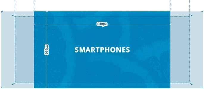
Here's the thing - the majority of users use Facebook on mobile phones. This means the majority of traffic on your business page will come from mobile users. However, it's worth understanding that Facebook automatically crops a portion of the banner while displaying it within the Facebook app on a smartphone. As a result, if you have inserted any crucial information on the sides of the image, it'll automatically get erased and the users won't be able to see it. To avoid this scenario, optimize your banner image in such a way that all the important elements are placed at the center of the banner. Here's a size breakdown of Facebook banners on the web and smartphones.

As you can see, content within the 640×360 dimensions will be visible on a mobile screen. So, make sure to design your banner accordingly.
2. Be Relevant to Your Niche
The banner image should be relevant to your niche, more specifically to your brand. As soon as a new user lands on the Facebook page, he'll only have a few seconds to process the banner image. It means if you have added unnecessary elements to the banner, it'll most likely discourage the users and they won't click the "Follow" button.
Make sure that the banner that you're uploading contains elements that describe your brand. Use an appropriate color scheme so that the banner can easily captivate the customers. To make the right decision, you can take a look at the competitor's banner designs and understand what's working in your niche.
3. Don't Keep the Save Cover for Too Long
As we mentioned earlier, keeping the same cover image for a longer period can damage your brand reputation in the market. Of course, you would not want to keep changing the banner every other day, but it's also not a wise decision to keep the same image for several months. Instead, keep a stock of banners and update them after every few weeks. This will allow you to keep the customers engaged and use social media as a considerable traffic source for your brand.
4. Use Online Designing Tools
As of now, the market is stacked with a wide variety of design tools that are specifically marketed as online Facebook cover makers. If you want to speed up the designing process and design visually engaging banners more rapidly, choosing these online tools will be far better than relying on tools like Adobe Photoshop. Such online tools have different built-in banner templates that you can import directly into your design and customize to create a bespoke banner image for your business page.
5. Keep It Simple
Finally, you must keep the Facebook cover image design as simple as possible because it'll help you draw more attention from the visitors. Adding unnecessary elements to the banner image will only make it complex and difficult to comprehend. So, research thoroughly, pick the right color scheme and make sure to keep the design simple so that you can draw attention from a wider audience.
Part 4A Detailed Guide in Making Facebook Banner across PixStudio
So, now that you are familiar with the best designing tips to create stunning Facebook banners, let's take a look at an online Facebook cover maker that'll help you with the designing process. Wondershare PixStudio is an online designing tool that's designed to create visually engaging thumbnails, YouTube channel art, logos, and even Facebook banners.
PixStudio has a dedicated media library where you can find hundreds of ready-to-use Facebook cover photo templates. With an easy drag-&-drop feature, you'll be able to import these templates to your design and customize them using a built-in editing panel.
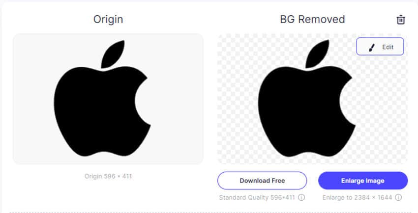
The editing panel offers various tools that'll allow you to customize the design of your template and design a custom banner image for your Facebook business page. The tool also has a built-in background remover that'll allow you to remove the background from an image instantly. It means if you are uploading a custom image or logo to the banner, the background remover will allow you to make it transparent with a single click.
So, here's the step-by-step process to create the perfect cover image for your Facebook business page using Wondershare PixStudio.
Step 1:
Go to https://ps.wondershare.com/ and click "Start Design Now".

Step 2:
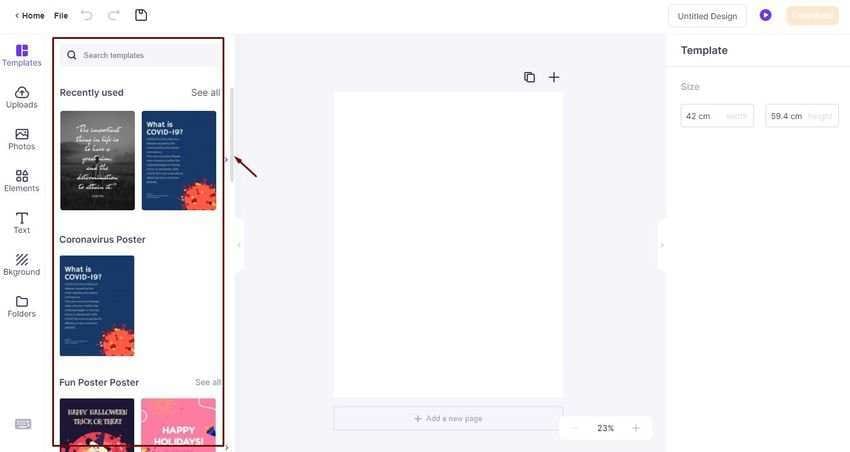
PixStudio's editing panel will pop up on your screen. Now, tap the "Template" tab and search for the template that you want to use as your banner. Alternatively, you can also scroll down to explore different templates.

Step 3:
After you've selected the right template, drag it to the Canvas area. Now, switch between different tabs on the left menu bar to add different elements (such as text and vector graphics) to the banner.
Step 4:
Once you are happy with the design, click "Download" at the top-right corner and choose the output format for the banner. Since Facebook only accepts PNGs and JPEGs as banner images, you should use one of them as the output format. Once again, click the "Download" button to save the image on your system.

Conclusion:So, that concludes our guide on how to create a Facebook cover image design that engages the audience and helps you improve your social media following. It's worth understanding that the banner will be the first thing that people will see on your business page. It means if you have used a visually appealing banner image, it'll help you leave a strong first impression on the viewers.
